Taking a 2,650-Mile (Virtual) Journey
The Genesis
Sometimes the best projects come from combining inspiration with opportunity. This project started as an idea in late spring 2021—a way to explore geographic visualization and narrative design in Tableau. What could have been just another map turned into a full journey of learning and iteration.
The deadline? A travel-themed viz challenge in mid-August. Sometimes these external motivations are exactly what you need to push a project to completion.
The Concept
The core idea was to create an interactive visualization that:
- Tells a geographic story - Following a route across a map
- Engages the user - Allowing exploration and discovery
- Uses real data - Grounding the narrative in actual information
- Showcases Tableau’s mapping capabilities - Demonstrating what’s possible with geographic visualizations
The Data
Mapping a 2,650-mile journey required:
- Route data - The geographic path from start to finish
- Waypoint information - Stops along the way with meaningful data
- Supporting metrics - Context that enriches each location
The data preparation phase was crucial — cleaning geographic coordinates, ensuring consistency, and organizing the data for narrative flow.
The Challenge
One of the biggest challenges was balancing visual interest with clarity. In geographic visualizations, it’s easy to create something that looks impressive but lacks meaning. The goal was to ensure that every visual element served the narrative.
Design Decisions
- Color progression - Using a color gradient to show journey progression
- Marker hierarchy - Size and emphasis to highlight important waypoints
- Interactive elements - Tooltips and filters for deeper exploration
- Supporting charts - Metrics that told the story beyond just geography
Key Insights from the Process
Maps Tell Stories
Geographic visualizations have unique power. They can:
- Show patterns that are invisible in tables
- Create emotional connection through space
- Enable exploration and discovery
Technical Implementation
The final visualization used:
- Tableau’s native geographic data
- Interactive buttons to reveal location-specific details
- Annotations highlighting key insights
The Results
The completed visualization:
- ✓ Successfully told the geographic narrative
- ✓ Was engaging and visually interesting
- ✓ Provided opportunities for exploration
- ✓ Performed well in the viz challenge
Lessons for Your Own Projects
- Complete the project - Even if inspiration wanes, having a deadline helps
- Iterate deliberately - Each revision should improve both form and function
- Balance design and data - Beautiful doesn’t mean unclear; clear doesn’t mean bland
- Geographic data is powerful - Consider maps for narratives with a spatial component
What’s Next
This project opens possibilities for:
- Interactive travel dashboards
- Geographic data storytelling
- Route optimization visualizations
- Location-based analytics
The 2,650 miles traveled in this visualization is just the beginning. What journey will your data tell?
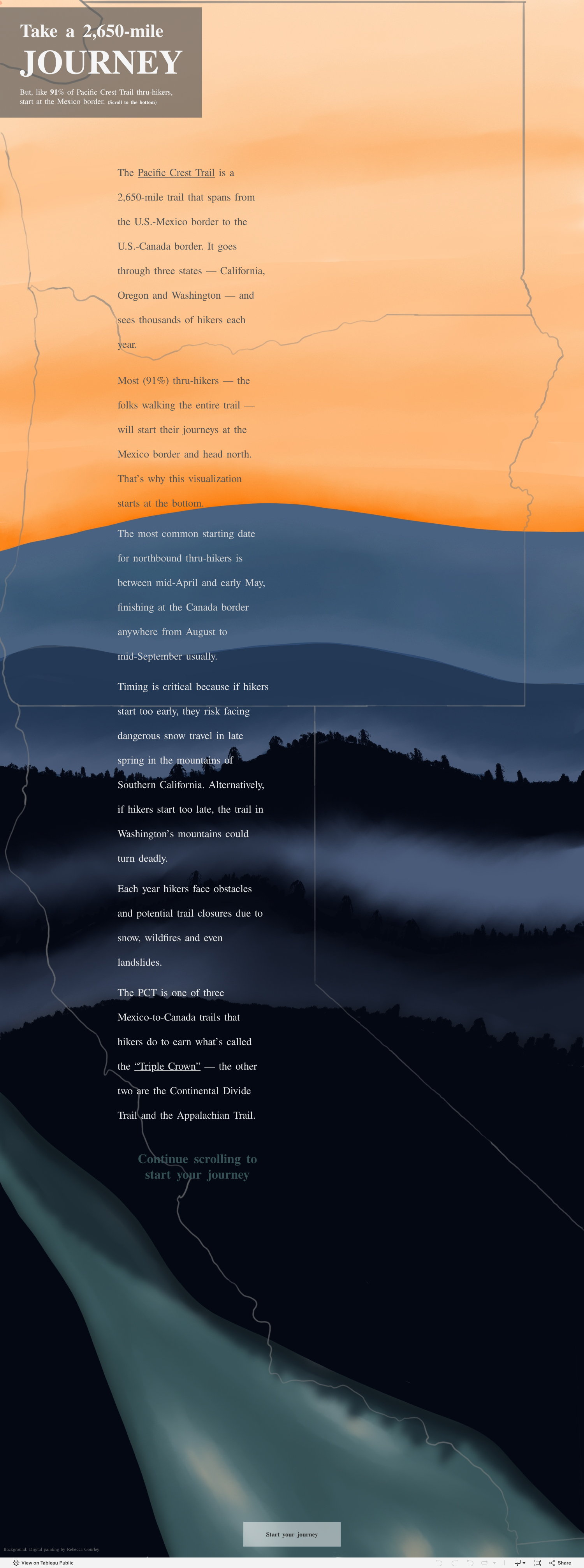
Click the image above to explore the interactive visualization